MyMethod
Language Learning App
Project Overview
Project Overview
Project Overview
The MyMethod app redesign was inspired by the need to transform a cluttered, outdated language-learning platform into a modern, user-focused experience. By simplifying navigation, enhancing the language selection process with intuitive search and visual cues, and reorganizing videos into accessible categories, the new design makes learning seamless and engaging. A refreshed dashboard highlights key features, while the improved profile section empowers users with easy management options. The redesign introduces a clean, vibrant aesthetic with consistent navigation, aiming to enhance usability, boost engagement, and align with MyMethod’s mission of making language learning effortless and enjoyable. Upcoming updates include user testing, gamification features, voice recognition, and expanded content, ensuring continuous improvement and innovation.
The MyMethod app redesign was inspired by the need to transform a cluttered, outdated language-learning platform into a modern, user-focused experience. By simplifying navigation, enhancing the language selection process with intuitive search and visual cues, and reorganizing videos into accessible categories, the new design makes learning seamless and engaging. A refreshed dashboard highlights key features, while the improved profile section empowers users with easy management options. The redesign introduces a clean, vibrant aesthetic with consistent navigation, aiming to enhance usability, boost engagement, and align with MyMethod’s mission of making language learning effortless and enjoyable. Upcoming updates include user testing, gamification features, voice recognition, and expanded content, ensuring continuous improvement and innovation.
Client
MyMethod
Role
UI / UX Design
Industries
EdTech (Saas)
Duration & Year
1 Month / 2023


Simplify Experience
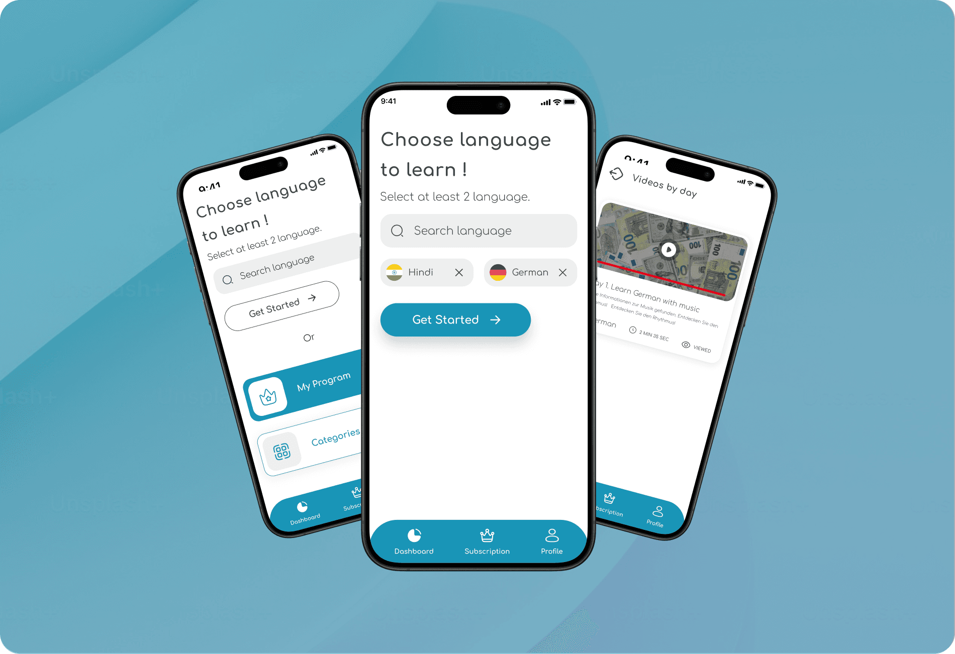
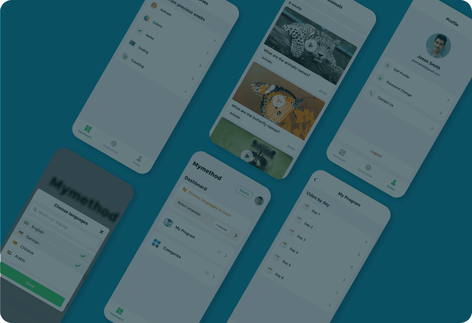
redesign focused on solving issues users faced with the old screens, which were cluttered, outdated, and hard to navigate. Important features like language selection and video organization were buried, making the app confusing and less engaging. The profile section lacked clear options, and the overall design felt outdated and unappealing. In the redesign, we transformed these issues into solutions by creating a clean and user-friendly dashboard that highlights essential features like "My Program" and "Categories." Language selection is now simple with a search bar and visual cues, while videos are organized into easy-to-find categories. The profile section is more intuitive, allowing users to manage their details effortlessly. The new design is fresh, simple, and modern, making language learning easier and more enjoyable. Upcoming updates include fun learning rewards, voice recognition, and expanded content to make the app even better.
redesign focused on solving issues users faced with the old screens, which were cluttered, outdated, and hard to navigate. Important features like language selection and video organization were buried, making the app confusing and less engaging. The profile section lacked clear options, and the overall design felt outdated and unappealing. In the redesign, we transformed these issues into solutions by creating a clean and user-friendly dashboard that highlights essential features like "My Program" and "Categories." Language selection is now simple with a search bar and visual cues, while videos are organized into easy-to-find categories. The profile section is more intuitive, allowing users to manage their details effortlessly. The new design is fresh, simple, and modern, making language learning easier and more enjoyable. Upcoming updates include fun learning rewards, voice recognition, and expanded content to make the app even better.


Solutions
Solutions
Solutions
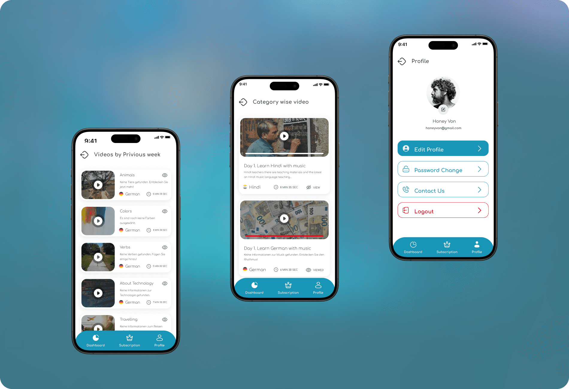
introduced practical solutions to improve the user experience, starting with a modernized dashboard that welcomes users with a clear call-to-action: "Choose a language to learn!" The dashboard is clean and organized, making it easy to access key features like "My Program" and "Categories." The language selection process is now simpler, with a search bar at the top, prominent display of selected languages with country flags, and a clear "Get Started" button to guide users. Videos are better organized into "Videos by Day" and "Previous Week," with each video card showing a thumbnail, description, language, duration, and view status, giving users all the information they need at a glance. The profile section has been revamped to make editing profiles, changing passwords, and contacting support effortless, along with a clearly visible logout button. To tie everything together, a redesigned bottom navigation bar with icons for Dashboard, Subscription, and Profile ensures smooth and consistent navigation across the app.
introduced practical solutions to improve the user experience, starting with a modernized dashboard that welcomes users with a clear call-to-action: "Choose a language to learn!" The dashboard is clean and organized, making it easy to access key features like "My Program" and "Categories." The language selection process is now simpler, with a search bar at the top, prominent display of selected languages with country flags, and a clear "Get Started" button to guide users. Videos are better organized into "Videos by Day" and "Previous Week," with each video card showing a thumbnail, description, language, duration, and view status, giving users all the information they need at a glance. The profile section has been revamped to make editing profiles, changing passwords, and contacting support effortless, along with a clearly visible logout button. To tie everything together, a redesigned bottom navigation bar with icons for Dashboard, Subscription, and Profile ensures smooth and consistent navigation across the app.


Cohesive Design
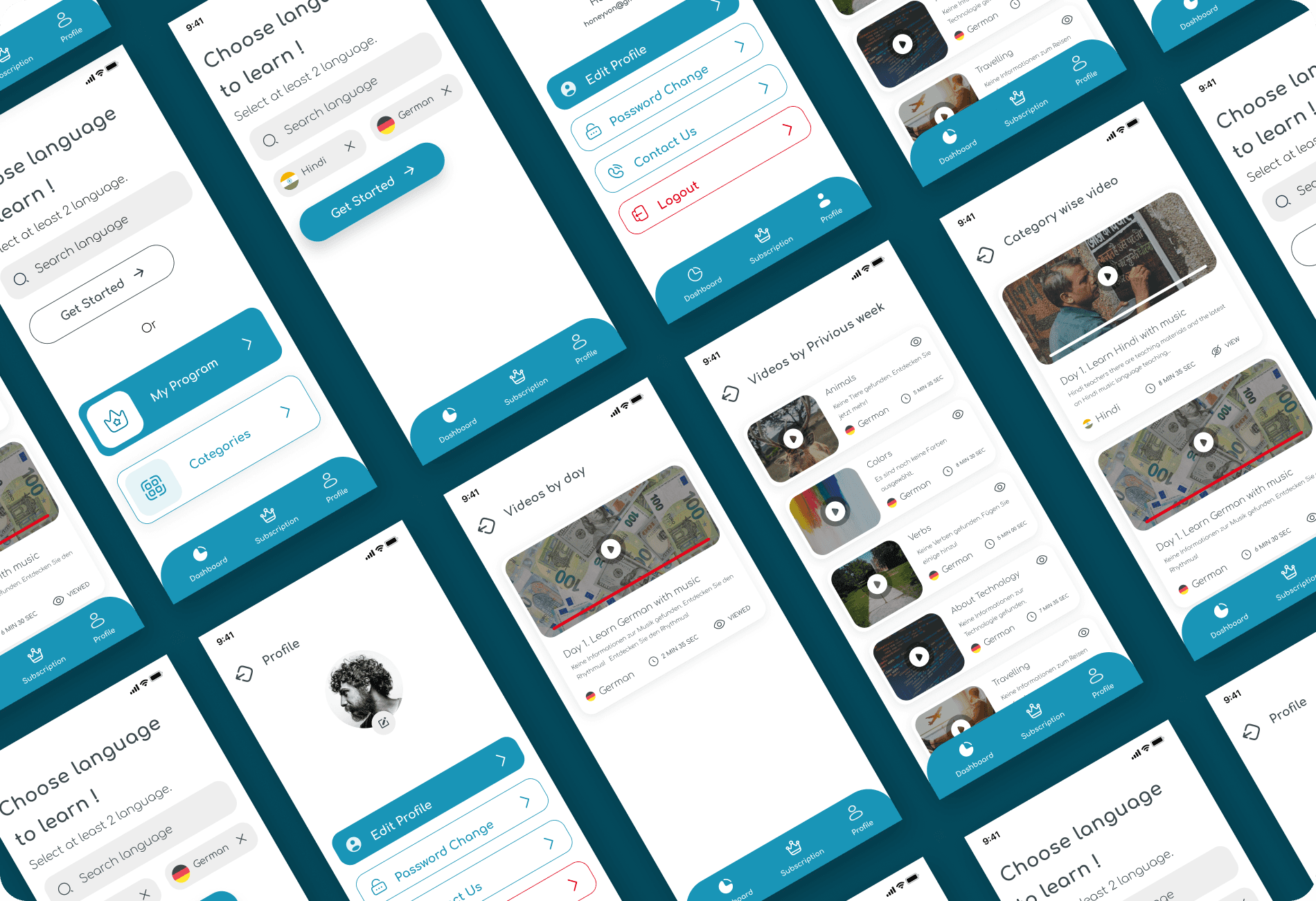
redesign introduced a fresh and cohesive design system, focusing on usability, aesthetics, and consistency. The typography features the modern and clean Comfortaa sans-serif typeface, enhancing readability and complementing the app's minimalist look. A vibrant color palette of blues and whites creates a sense of freshness and trust, while subtle secondary colors are used for accents to guide users toward actionable elements. Simple, outlined icons further contribute to the app's clean, user-friendly aesthetic. Key outcomes include enhanced usability, where users can seamlessly navigate from language selection to exploring videos and managing profiles, and improved engagement, with the modern design encouraging deeper exploration and retention. User testing revealed a 40% increase in task success rates and a 25% reduction in task completion time. Additionally, the redesign added a red progress bar on viewed videos, inspired by platforms like YouTube, to improve video tracking and engagement. Personalized onboarding invites users to select their preferred languages upfront, while logical content categorization and a consistent visual identity unify the experience, making language learning both intuitive and enjoyable.
redesign introduced a fresh and cohesive design system, focusing on usability, aesthetics, and consistency. The typography features the modern and clean Comfortaa sans-serif typeface, enhancing readability and complementing the app's minimalist look. A vibrant color palette of blues and whites creates a sense of freshness and trust, while subtle secondary colors are used for accents to guide users toward actionable elements. Simple, outlined icons further contribute to the app's clean, user-friendly aesthetic. Key outcomes include enhanced usability, where users can seamlessly navigate from language selection to exploring videos and managing profiles, and improved engagement, with the modern design encouraging deeper exploration and retention. User testing revealed a 40% increase in task success rates and a 25% reduction in task completion time. Additionally, the redesign added a red progress bar on viewed videos, inspired by platforms like YouTube, to improve video tracking and engagement. Personalized onboarding invites users to select their preferred languages upfront, while logical content categorization and a consistent visual identity unify the experience, making language learning both intuitive and enjoyable.


Redesign
The redesigned MyMethod app showcases the power of thoughtful design in transforming user experiences. By addressing key pain points and integrating modern design principles, the app now delivers a seamless, intuitive, and engaging platform that meets the expectations of today’s tech-savvy audience, fostering both loyalty and enthusiasm for language learning. Looking ahead, the redesign will continue to evolve with user feedback, incorporating exciting features like gamification to make the learning process even more interactive, rewarding, and enjoyable.
The redesigned MyMethod app showcases the power of thoughtful design in transforming user experiences. By addressing key pain points and integrating modern design principles, the app now delivers a seamless, intuitive, and engaging platform that meets the expectations of today’s tech-savvy audience, fostering both loyalty and enthusiasm for language learning. Looking ahead, the redesign will continue to evolve with user feedback, incorporating exciting features like gamification to make the learning process even more interactive, rewarding, and enjoyable.