VaultDB.ai
AI-Infused Platform
Project Overview
Project Overview
Project Overview
VaultDB.ai, a cutting-edge distributed and AI-powered database platform optimized for IoT and enterprise systems, required a brand identity and a professional, user-friendly website to showcase its innovation and security. The project involved crafting a vault-inspired logo symbolizing data protection, selecting a modern purple gradient color palette, and using Oxanium and DM Sans typography to create a sleek, futuristic look. The website design journey included multiple iterations, starting with low-fidelity wireframes and transitioning from a light theme to a dark mode with glass morphism effects to better align with VaultDB’s technical focus. The final deliverables included a minimalist website with key pages such as Home, About Us, Contact Us, and developer-focused technical documentation like Installation and Quick Start guides. This project successfully balanced technical complexity with a clean, engaging design, providing VaultDB.ai with a strong digital presence and cohesive branding.
VaultDB.ai, a cutting-edge distributed and AI-powered database platform optimized for IoT and enterprise systems, required a brand identity and a professional, user-friendly website to showcase its innovation and security. The project involved crafting a vault-inspired logo symbolizing data protection, selecting a modern purple gradient color palette, and using Oxanium and DM Sans typography to create a sleek, futuristic look. The website design journey included multiple iterations, starting with low-fidelity wireframes and transitioning from a light theme to a dark mode with glass morphism effects to better align with VaultDB’s technical focus. The final deliverables included a minimalist website with key pages such as Home, About Us, Contact Us, and developer-focused technical documentation like Installation and Quick Start guides. This project successfully balanced technical complexity with a clean, engaging design, providing VaultDB.ai with a strong digital presence and cohesive branding.
Client
VaultDB
Role
Branding and Website UI/UX Design
Industries
Technology (IoT and AI)
Duration & Year
1 Month / 2023


The Beginning
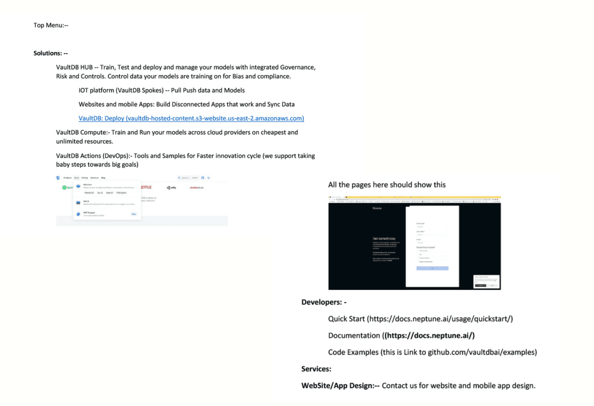
When VaultDB approached me, they had a bold idea to change how databases work. Their product wasn’t just another database; it was a secure, AI-powered system built for IoT devices and businesses that deal with massive amounts of data. Their challenge was to create a brand and website that could explain what they do in a way that was modern, easy to understand, and trustworthy. They wanted a brand that would: Show security - Because VaultDB is all about protecting data. Feel futuristic - Because they’re building advanced technology. Be professional yet simple - So anyone, from developers to investors, could connect with it.
When VaultDB approached me, they had a bold idea to change how databases work. Their product wasn’t just another database; it was a secure, AI-powered system built for IoT devices and businesses that deal with massive amounts of data. Their challenge was to create a brand and website that could explain what they do in a way that was modern, easy to understand, and trustworthy. They wanted a brand that would: Show security - Because VaultDB is all about protecting data. Feel futuristic - Because they’re building advanced technology. Be professional yet simple - So anyone, from developers to investors, could connect with it.


Work On Logo
Work On Logo
Work On Logo
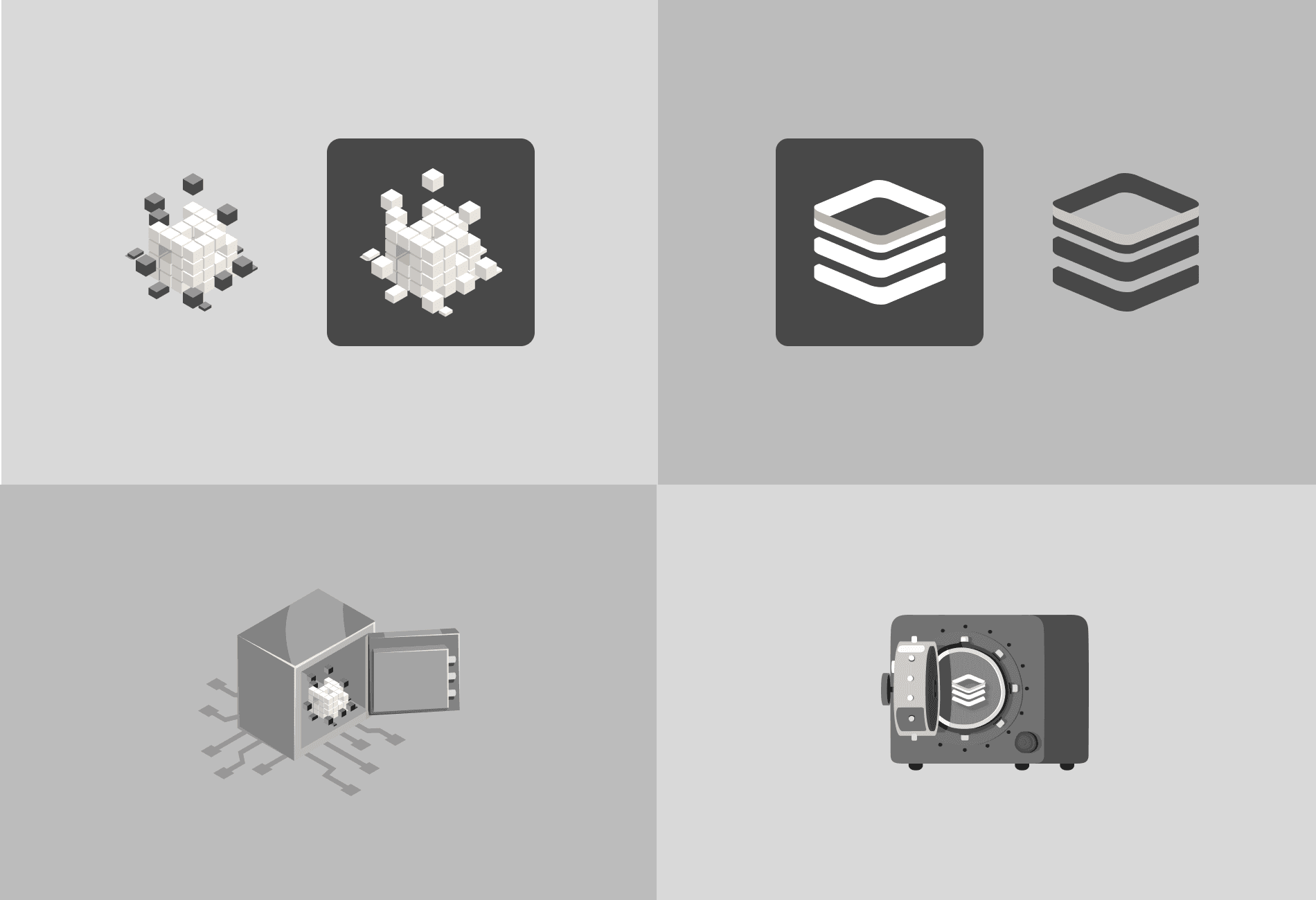
The first step was the logo. I needed to create something that captured the idea of security and data organisation. For the first meeting, I designed some logos inspired by cubes and grids to represent distributed systems. When I showed them these ideas, they appreciated the effort but felt something was missing. They suggested that I have to try creating a logo that looked more like a vault or locker, something that clearly showed protection and security. I went back to the board. This time, I focused on combining the idea of a vault with a modern and sleek design. I created two new illustration concepts: A vault with an open door and cubes inside to represent protected data. A layered vault that looked futuristic and represented their advanced technology. I showed these new designs in our next meeting. They liked the direction, but the designs still felt a bit too illustrative. They wanted something more iconic, A logo that could work even on small screens and still represent VaultDB’s brand.
The first step was the logo. I needed to create something that captured the idea of security and data organisation. For the first meeting, I designed some logos inspired by cubes and grids to represent distributed systems. When I showed them these ideas, they appreciated the effort but felt something was missing. They suggested that I have to try creating a logo that looked more like a vault or locker, something that clearly showed protection and security. I went back to the board. This time, I focused on combining the idea of a vault with a modern and sleek design. I created two new illustration concepts: A vault with an open door and cubes inside to represent protected data. A layered vault that looked futuristic and represented their advanced technology. I showed these new designs in our next meeting. They liked the direction, but the designs still felt a bit too illustrative. They wanted something more iconic, A logo that could work even on small screens and still represent VaultDB’s brand.


Colors and Fonts
Before finalizing the logo, we decided to settle on the colors and fonts for the brand. I presented a selection of gradient color palettes, and they immediately liked the purple gradient. Purple worked well because it feels modern, trustworthy, and innovative—perfect for VaultDB. For fonts, I suggested: Oxanium for the logo: A sharp and futuristic font to match their technical edge. DM Sans for the website: A clean and simple font that’s easy to read. With the colors and fonts finalized, I went back to work on the logo.
Before finalizing the logo, we decided to settle on the colors and fonts for the brand. I presented a selection of gradient color palettes, and they immediately liked the purple gradient. Purple worked well because it feels modern, trustworthy, and innovative—perfect for VaultDB. For fonts, I suggested: Oxanium for the logo: A sharp and futuristic font to match their technical edge. DM Sans for the website: A clean and simple font that’s easy to read. With the colors and fonts finalized, I went back to work on the logo.


The Final Logo
This time, I simplified the design. I created a vault-inspired logo with clean lines, representing security and layers of data. I added the purple gradient to tie it to the brand’s colors. When I presented this version, they loved it. The logo felt modern, professional, and exactly what they were looking for. It was simple yet meaningful—a symbol of security and trust.
This time, I simplified the design. I created a vault-inspired logo with clean lines, representing security and layers of data. I added the purple gradient to tie it to the brand’s colors. When I presented this version, they loved it. The logo felt modern, professional, and exactly what they were looking for. It was simple yet meaningful—a symbol of security and trust.


Website Design
After finalizing the branding, the next step was to bring VaultDB.ai to life through its website by designing a modern, professional, and user-friendly platform that explained the product’s features clearly and engagingly. I started with low-fidelity wireframes to map out the layout, including key pages such as Home, About Us, Contact Us, a Features section highlighting capabilities like GRC and IoT optimization, an FAQ section, a step-by-step How It Works page, a Partners section, and essential footer links. While the layout was appreciated, the feedback indicated the website felt too large and detailed for VaultDB.ai’s initial needs. As they were in their early stages, the team opted for a minimalist, focused website that could grow as the product evolved.
After finalizing the branding, the next step was to bring VaultDB.ai to life through its website by designing a modern, professional, and user-friendly platform that explained the product’s features clearly and engagingly. I started with low-fidelity wireframes to map out the layout, including key pages such as Home, About Us, Contact Us, a Features section highlighting capabilities like GRC and IoT optimization, an FAQ section, a step-by-step How It Works page, a Partners section, and essential footer links. While the layout was appreciated, the feedback indicated the website felt too large and detailed for VaultDB.ai’s initial needs. As they were in their early stages, the team opted for a minimalist, focused website that could grow as the product evolved.


Light Mode
After discussing the wireframes, I moved to high-fidelity designs in a light mode theme, incorporating soft gradients, colorful shapes for personality, a vibrant features section with detailed descriptions, and visuals for the How It Works section to simplify technical processes. While the fresh, colorful design was appreciated, it felt too complex for VaultDB.ai’s early-stage needs. The team found the Features and How It Works sections too detailed and overwhelming, and they decided to remove the Partners section entirely as partnerships had not been finalized. This feedback led to a simplified, lean design focused on introducing VaultDB’s purpose, with minimal sections that could grow as the product developed.
After discussing the wireframes, I moved to high-fidelity designs in a light mode theme, incorporating soft gradients, colorful shapes for personality, a vibrant features section with detailed descriptions, and visuals for the How It Works section to simplify technical processes. While the fresh, colorful design was appreciated, it felt too complex for VaultDB.ai’s early-stage needs. The team found the Features and How It Works sections too detailed and overwhelming, and they decided to remove the Partners section entirely as partnerships had not been finalized. This feedback led to a simplified, lean design focused on introducing VaultDB’s purpose, with minimal sections that could grow as the product developed.


The Conclusion
The Conclusion
The Conclusion
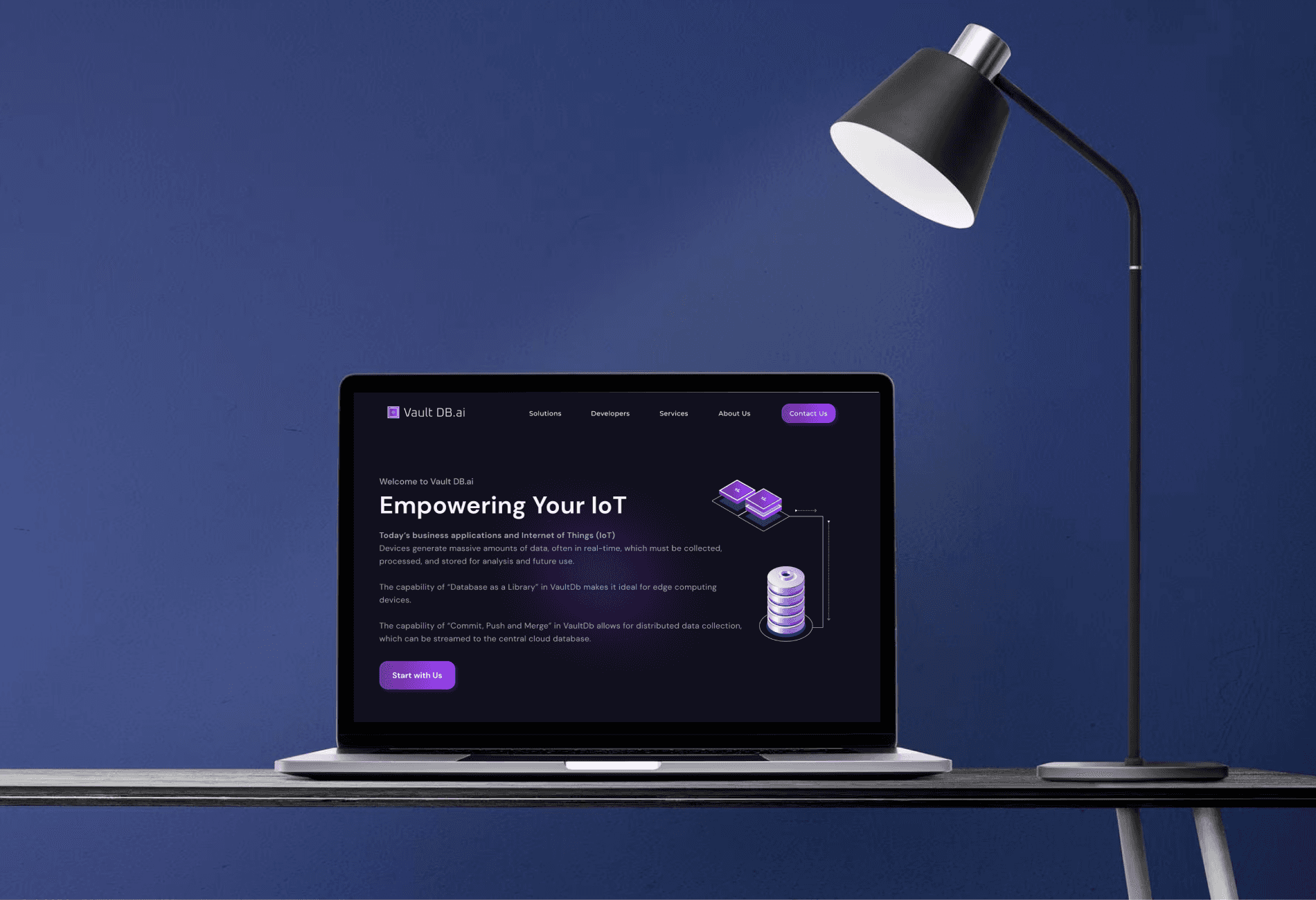
Based on the feedback, I decided to redesign the website using a dark mode theme, which felt more in line with VaultDB.ai’s identity. Dark themes are known for looking modern, professional, and perfect for tech-focused audiences. At the same time, I simplified the website content to keep it minimal and easy to navigate. The Features section, which previously had long descriptions, was reduced to short highlights on the Home Page. The How It Works section was simplified into three easy steps with simple icons, and the Partners section was removed entirely because there weren’t partnerships to show yet. Even the FAQ page was trimmed to only the most essential questions, and the footer was cleaned up to include only key links like Privacy Policy and Terms & Conditions. The goal was to focus on just the core pages: the Home Page to showcase VaultDB’s purpose, About Us to tell their story, Contact Us to keep communication simple, and technical guides like Quick Start and Installation to help developers. Additionally, I made sure to approach the design with responsiveness in mind, ensuring the website adapted seamlessly to different screen sizes and devices, offering users a consistent experience on desktops, tablets, and mobile phones. Switching to dark mode wasn’t just a style choice—it reflected VaultDB.ai’s bold and innovative brand. I added glass morphism effects for a polished, modern look and used the purple gradient consistently to highlight important buttons and sections. The DM Sans font ensured everything was clean and easy to read on the dark background. When designing for responsiveness, I focused on mobile-first design principles, ensuring key elements like buttons, forms, and visuals were optimized for smaller screens while still looking sleek on larger ones. When I presented the updated design, the VaultDB team appreciated how sleek and professional it looked while still being simple and user-friendly across all devices. As we got closer to the final version, I added custom visuals on the Home Page to make technical concepts like distributed databases and GRC easier to understand, refined the Contact Us form with product-specific options, and expanded the FAQ section slightly to answer more common questions. The final design was exactly what VaultDB.ai needed: a clean, responsive, engaging, and professional website that reflected their values and mission. It was a true representation of their innovative product, ready to help them grow and make an impact in the tech industry.
Based on the feedback, I decided to redesign the website using a dark mode theme, which felt more in line with VaultDB.ai’s identity. Dark themes are known for looking modern, professional, and perfect for tech-focused audiences. At the same time, I simplified the website content to keep it minimal and easy to navigate. The Features section, which previously had long descriptions, was reduced to short highlights on the Home Page. The How It Works section was simplified into three easy steps with simple icons, and the Partners section was removed entirely because there weren’t partnerships to show yet. Even the FAQ page was trimmed to only the most essential questions, and the footer was cleaned up to include only key links like Privacy Policy and Terms & Conditions. The goal was to focus on just the core pages: the Home Page to showcase VaultDB’s purpose, About Us to tell their story, Contact Us to keep communication simple, and technical guides like Quick Start and Installation to help developers. Additionally, I made sure to approach the design with responsiveness in mind, ensuring the website adapted seamlessly to different screen sizes and devices, offering users a consistent experience on desktops, tablets, and mobile phones. Switching to dark mode wasn’t just a style choice—it reflected VaultDB.ai’s bold and innovative brand. I added glass morphism effects for a polished, modern look and used the purple gradient consistently to highlight important buttons and sections. The DM Sans font ensured everything was clean and easy to read on the dark background. When designing for responsiveness, I focused on mobile-first design principles, ensuring key elements like buttons, forms, and visuals were optimized for smaller screens while still looking sleek on larger ones. When I presented the updated design, the VaultDB team appreciated how sleek and professional it looked while still being simple and user-friendly across all devices. As we got closer to the final version, I added custom visuals on the Home Page to make technical concepts like distributed databases and GRC easier to understand, refined the Contact Us form with product-specific options, and expanded the FAQ section slightly to answer more common questions. The final design was exactly what VaultDB.ai needed: a clean, responsive, engaging, and professional website that reflected their values and mission. It was a true representation of their innovative product, ready to help them grow and make an impact in the tech industry.


