Win-Mart
E-Commerce App
Project Overview
Project Overview
Project Overview
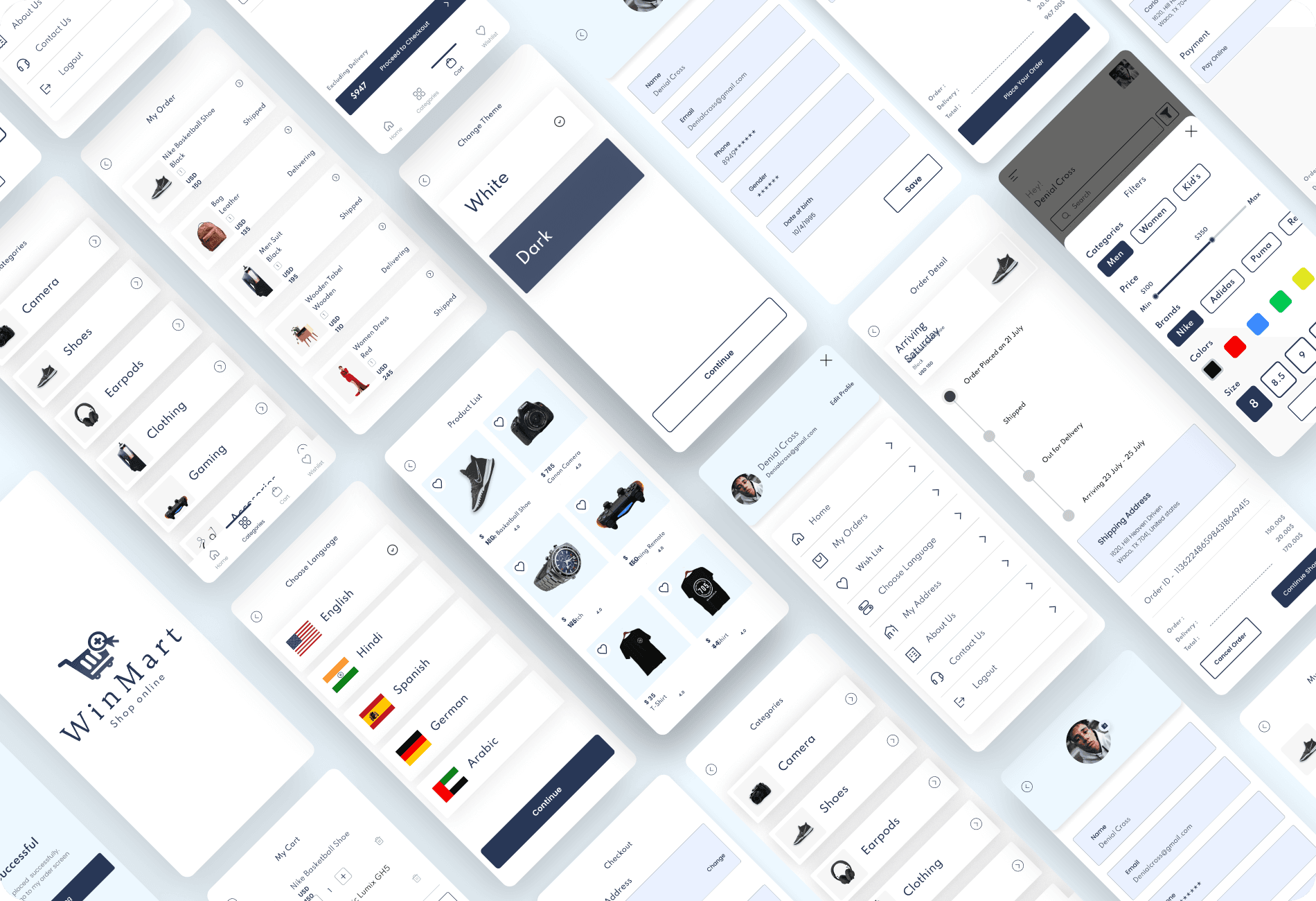
The WinMart e-commerce mobile app was designed as a React JS template for developers to create customizable, single-vendor e-commerce platforms. Focusing on user-friendly navigation and a mobile-first design, the app features multi-language support, product image sliders, and a bottom navigation menu. It offers a clean, responsive layout for both Android and iOS devices, making it easy for developers to adapt and integrate the template into their own stores. The design aims to provide a seamless experience for both users and developers, ensuring simplicity and functionality.
The WinMart e-commerce mobile app was designed as a React JS template for developers to create customizable, single-vendor e-commerce platforms. Focusing on user-friendly navigation and a mobile-first design, the app features multi-language support, product image sliders, and a bottom navigation menu. It offers a clean, responsive layout for both Android and iOS devices, making it easy for developers to adapt and integrate the template into their own stores. The design aims to provide a seamless experience for both users and developers, ensuring simplicity and functionality.
Client
Code Signful
Role
UI & UX Designer
Industries
E-Commerce
Duration & Year
2 Months / 2020


Why This Project
My client wanted to provide a solution that would save developers time while ensuring they could easily adapt the design to their needs. By focusing on user-friendly navigation, mobile responsiveness, and multi-language support, I aimed to create an intuitive app that not only delivers a seamless shopping experience but also offers a flexible, easy-to-customize template for developers. This project bridges the gap between design and development, giving developers a tool to efficiently create e-commerce sites without compromising on quality or functionality. The client’s goal for the WinMart e-commerce app was to create a flexible and customizable React JS template that developers could easily integrate into single-vendor e-commerce platforms. They wanted the design to be developer-friendly, with features like multi-language support, an intuitive mobile-first design, and simple customization options. The app needed to be responsive, visually appealing, and easy for end-users to navigate, from browsing products to completing purchases. It had to feature essential e-commerce functionalities like product browsing, cart management, and a straightforward checkout process, while also allowing developers to customize payment gateways, shipping options, and other elements. By understanding these core needs, I focused on creating a seamless user experience that would not only meet the client’s technical requirements but also ensure ease of use for both developers and end-users.
My client wanted to provide a solution that would save developers time while ensuring they could easily adapt the design to their needs. By focusing on user-friendly navigation, mobile responsiveness, and multi-language support, I aimed to create an intuitive app that not only delivers a seamless shopping experience but also offers a flexible, easy-to-customize template for developers. This project bridges the gap between design and development, giving developers a tool to efficiently create e-commerce sites without compromising on quality or functionality. The client’s goal for the WinMart e-commerce app was to create a flexible and customizable React JS template that developers could easily integrate into single-vendor e-commerce platforms. They wanted the design to be developer-friendly, with features like multi-language support, an intuitive mobile-first design, and simple customization options. The app needed to be responsive, visually appealing, and easy for end-users to navigate, from browsing products to completing purchases. It had to feature essential e-commerce functionalities like product browsing, cart management, and a straightforward checkout process, while also allowing developers to customize payment gateways, shipping options, and other elements. By understanding these core needs, I focused on creating a seamless user experience that would not only meet the client’s technical requirements but also ensure ease of use for both developers and end-users.


User Flow
User Flow
User Flow
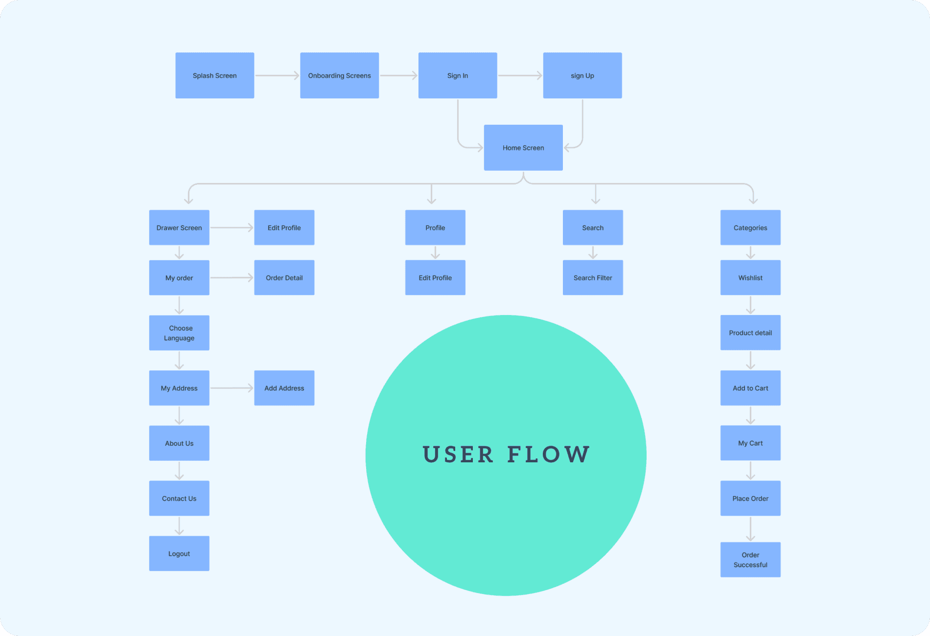
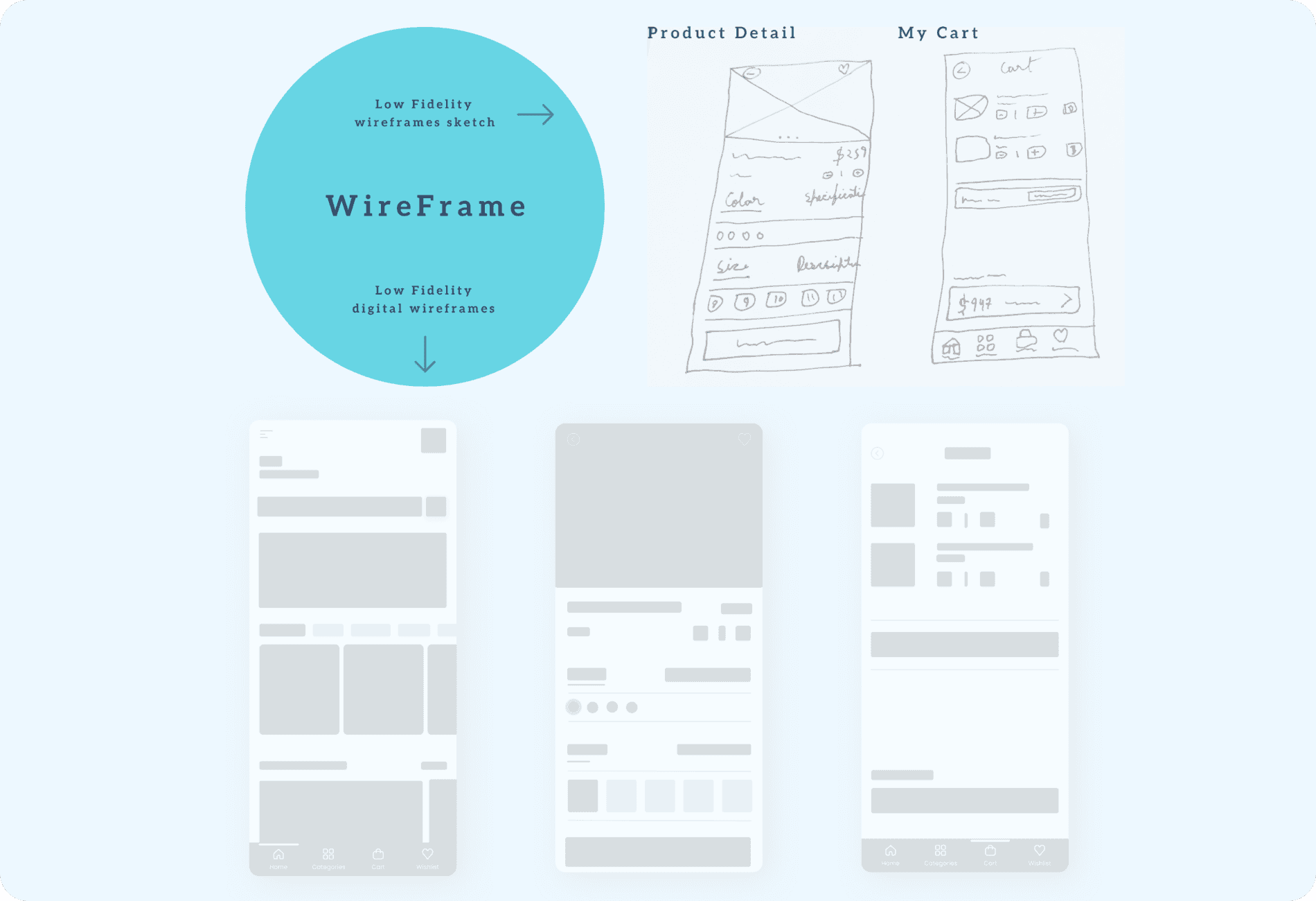
To ensure a seamless and intuitive experience, I began by mapping out the user flow, outlining the logical progression from the splash screen through the onboarding process, and then to the home screen where users could browse categories, view featured products, and access deals of the day. The flow also included essential screens like the product detail page, cart, and checkout to create a smooth, uninterrupted journey. I then moved on to wireframing, sketching the basic layout of these screens to focus on structure and functionality. The wireframes included a search bar on the home screen, an add to cart button on the product detail screen, and clear options for changing quantities, applying coupons, and proceeding to checkout on the cart and checkout screens. These wireframes helped ensure a user-friendly design and set the foundation for a responsive, easy-to-navigate app.
To ensure a seamless and intuitive experience, I began by mapping out the user flow, outlining the logical progression from the splash screen through the onboarding process, and then to the home screen where users could browse categories, view featured products, and access deals of the day. The flow also included essential screens like the product detail page, cart, and checkout to create a smooth, uninterrupted journey. I then moved on to wireframing, sketching the basic layout of these screens to focus on structure and functionality. The wireframes included a search bar on the home screen, an add to cart button on the product detail screen, and clear options for changing quantities, applying coupons, and proceeding to checkout on the cart and checkout screens. These wireframes helped ensure a user-friendly design and set the foundation for a responsive, easy-to-navigate app.


Color, Typo & Home
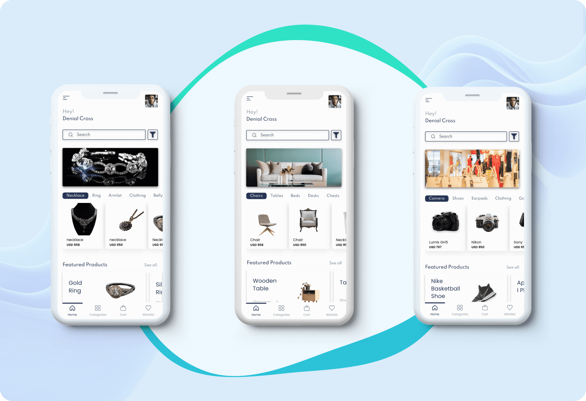
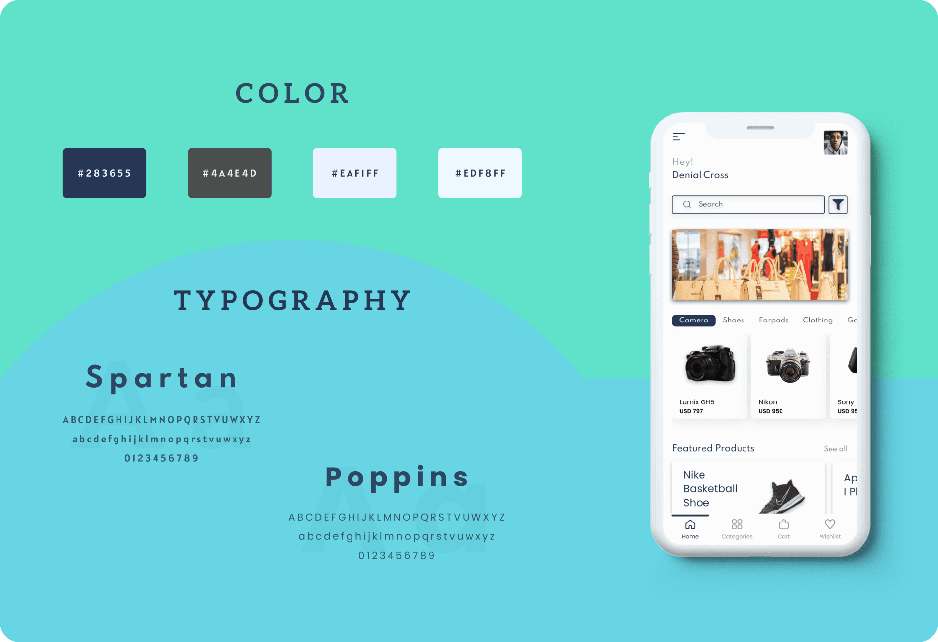
The design is highly adaptable, ensuring businesses of all sizes can tailor the app to suit their unique products and brand identity. Key elements like product categories, featured products, and deals of the day were prominently displayed, with a search bar at the top for easy product navigation and a toggle menu to access the Wishlist, Cart, and Profile. I selected a blue color palette, using a rich, calming shade for interactive elements like buttons and links, creating a sense of trust and reliability while drawing the user’s attention to key actions. The background was kept neutral with soft grays and whites to keep the focus on the products themselves. For typography, I chose Spartan for headings, a bold yet elegant font that ensures important information stands out without being too aggressive, and Poppins for the body text, providing a modern, clean look that’s easy to read on all devices. This combination of blue accents, Spartan for hierarchy, and Poppins for readability came together to create a balanced, adaptable home screen—perfect for businesses looking to provide a seamless and polished shopping experience.
The design is highly adaptable, ensuring businesses of all sizes can tailor the app to suit their unique products and brand identity. Key elements like product categories, featured products, and deals of the day were prominently displayed, with a search bar at the top for easy product navigation and a toggle menu to access the Wishlist, Cart, and Profile. I selected a blue color palette, using a rich, calming shade for interactive elements like buttons and links, creating a sense of trust and reliability while drawing the user’s attention to key actions. The background was kept neutral with soft grays and whites to keep the focus on the products themselves. For typography, I chose Spartan for headings, a bold yet elegant font that ensures important information stands out without being too aggressive, and Poppins for the body text, providing a modern, clean look that’s easy to read on all devices. This combination of blue accents, Spartan for hierarchy, and Poppins for readability came together to create a balanced, adaptable home screen—perfect for businesses looking to provide a seamless and polished shopping experience.


App Functionality
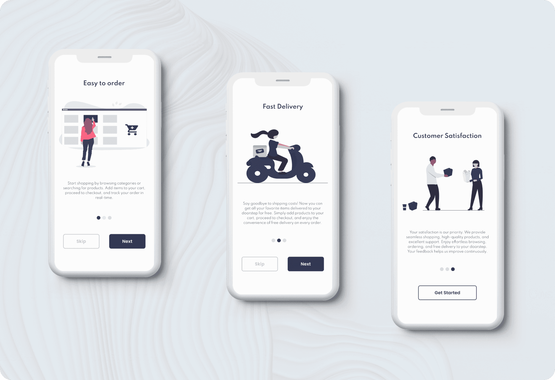
To ensure a seamless introduction to the app, I designed an intuitive onboarding process that guided users through the key features and functionality. The goal was to make new users feel comfortable and informed from the start. Once onboard, they were taken to the home screen, which offered a clean, visually appealing layout with easy navigation to categories, featured products, and deals of the day. The home screen also included a prominent search bar for quick product discovery and a bottom navigation menu for effortless access to key sections like the Wishlist and Cart. Moving into the product pages, I aimed to create an engaging experience by including a product image slider that allowed users to view products from different angles, making the shopping experience more dynamic. Features like a color picker and an add-to-wishlist button were incorporated to offer more personalization, while the add to cart button was designed to be prominent and responsive, ensuring users could easily add items without distraction. I also added a product review section with star ratings and user feedback to help guide purchasing decisions. These interactive elements were designed to not only highlight the products effectively but also empower users to engage with them in a way that felt intuitive and enjoyable.
To ensure a seamless introduction to the app, I designed an intuitive onboarding process that guided users through the key features and functionality. The goal was to make new users feel comfortable and informed from the start. Once onboard, they were taken to the home screen, which offered a clean, visually appealing layout with easy navigation to categories, featured products, and deals of the day. The home screen also included a prominent search bar for quick product discovery and a bottom navigation menu for effortless access to key sections like the Wishlist and Cart. Moving into the product pages, I aimed to create an engaging experience by including a product image slider that allowed users to view products from different angles, making the shopping experience more dynamic. Features like a color picker and an add-to-wishlist button were incorporated to offer more personalization, while the add to cart button was designed to be prominent and responsive, ensuring users could easily add items without distraction. I also added a product review section with star ratings and user feedback to help guide purchasing decisions. These interactive elements were designed to not only highlight the products effectively but also empower users to engage with them in a way that felt intuitive and enjoyable.


Cart & Checkout
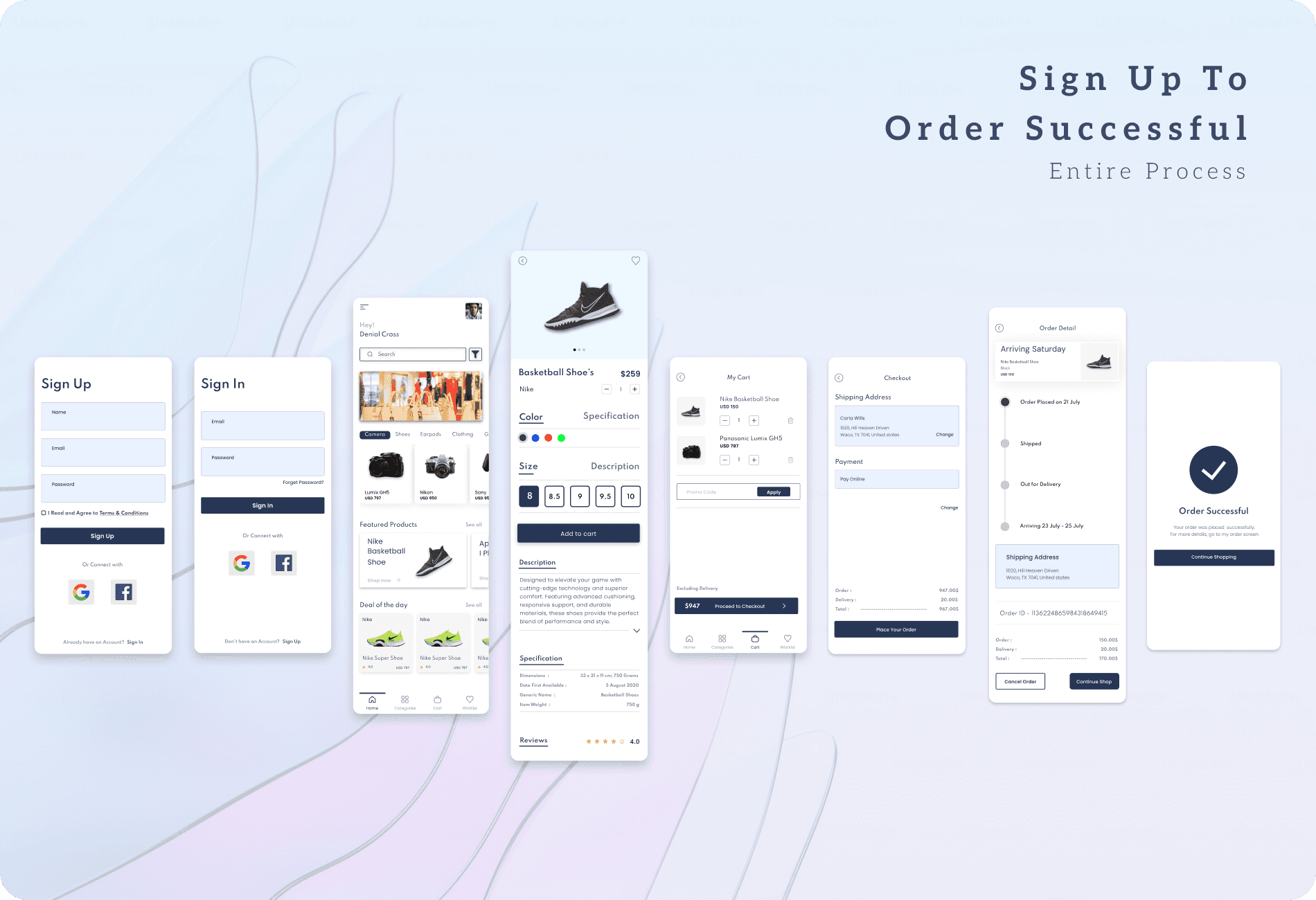
The cart and checkout screens were carefully crafted to ensure a seamless transition from product selection to final purchase. On the cart screen, I made it easy for users to view their selected items, adjust quantities, remove products, and apply coupon codes. The total price was displayed clearly, including any discounts and delivery charges, providing transparency throughout the shopping process. Moving to the checkout screen, I focused on simplicity and clarity, featuring easy-to-fill fields for shipping address and payment methods, with an order summary displaying the final cost and delivery details. The design aimed to minimize friction, allowing users to move through the checkout process with ease and confidence. By keeping the design straightforward and user-friendly, I ensured that the experience felt seamless, reducing any potential obstacles that might discourage users from completing their purchase.
The cart and checkout screens were carefully crafted to ensure a seamless transition from product selection to final purchase. On the cart screen, I made it easy for users to view their selected items, adjust quantities, remove products, and apply coupon codes. The total price was displayed clearly, including any discounts and delivery charges, providing transparency throughout the shopping process. Moving to the checkout screen, I focused on simplicity and clarity, featuring easy-to-fill fields for shipping address and payment methods, with an order summary displaying the final cost and delivery details. The design aimed to minimize friction, allowing users to move through the checkout process with ease and confidence. By keeping the design straightforward and user-friendly, I ensured that the experience felt seamless, reducing any potential obstacles that might discourage users from completing their purchase.


Conclusion
Conclusion
Conclusion
The WinMart app was designed to provide a seamless and engaging experience for both users and developers, offering a flexible, scalable solution for businesses of all sizes. From the onboarding process to the home screen, the app ensures a smooth navigation experience, allowing users to easily explore products, save favorites, and make informed purchasing decisions through interactive elements like image sliders, color pickers, and product reviews. The cart and checkout screens were designed for simplicity and efficiency, making it easy to adjust quantities, apply coupons, and complete purchases with confidence. With multi-language support integrated, the app caters to a global audience, allowing businesses to localize and customize the app for different regions without compromising the design. Overall, the WinMart app offers businesses a powerful, user-friendly platform to launch personalized online stores quickly, while providing customers with a smooth, enjoyable shopping experience.
The WinMart app was designed to provide a seamless and engaging experience for both users and developers, offering a flexible, scalable solution for businesses of all sizes. From the onboarding process to the home screen, the app ensures a smooth navigation experience, allowing users to easily explore products, save favorites, and make informed purchasing decisions through interactive elements like image sliders, color pickers, and product reviews. The cart and checkout screens were designed for simplicity and efficiency, making it easy to adjust quantities, apply coupons, and complete purchases with confidence. With multi-language support integrated, the app caters to a global audience, allowing businesses to localize and customize the app for different regions without compromising the design. Overall, the WinMart app offers businesses a powerful, user-friendly platform to launch personalized online stores quickly, while providing customers with a smooth, enjoyable shopping experience.
